Learning Objectives
- Create and interpret frequency polygons
- Create and interpret cumulative frequency polygons
- Create and interpret overlaid frequency polygons
Frequency polygons are a graphical
device for understanding the shapes of distributions. They
serve the same purpose as histograms, but are especially helpful
for comparing sets of data. Frequency polygons are also a
good choice for displaying cumulative frequency distributions.
To create a frequency polygon,
start just as for histograms, by choosing
a class interval. Then draw
an X-axis representing the values of the scores in your data.
Mark the middle of each class interval with a tick mark, and label
it with the middle value represented by the class. Draw the Y-axis
to indicate the frequency of each class. Place a point in the
middle of each class interval at the height corresponding to its
frequency. Finally, connect the points. You should include one
class interval below the lowest value in your data and one above
the highest value. The graph will then touch the X-axis on both
sides.
A frequency polygon for 642 psychology test scores
shown in Figure 1 was constructed from the frequency table shown in Table 1.
Table 1. Frequency Distribution of Psychology Test Scores.
| Lower Limit | Upper Limit | Count | Cumulative Count |
|---|---|---|---|
| 29.5 | 39.5 | 0 | 0 |
| 39.5 | 49.5 | 3 | 3 |
| 49.5 | 59.5 | 10 | 13 |
| 59.5 | 69.5 | 53 | 66 |
| 69.5 | 79.5 | 107 | 173 |
| 79.5 | 89.5 | 147 | 320 |
| 89.5 | 99.5 | 130 | 450 |
| 99.5 | 109.5 | 78 | 528 |
| 109.5 | 119.5 | 59 | 587 |
| 119.5 | 129.5 | 36 | 623 |
| 129.5 | 139.5 | 11 | 634 |
| 139.5 | 149.5 | 6 | 640 |
| 149.5 | 159.5 | 1 | 641 |
| 159.5 | 169.5 | 1 | 642 |
| 169.5 | 179.5 | 0 | 642 |
The first label on the X-axis is 35. This
represents an interval extending from 29.5 to 39.5. Since the
lowest test score is 46, this interval has a frequency of 0. The
point labeled 45 represents the interval from 39.5 to 49.5. There
are three scores in this interval. There are 147 scores in the
interval that surrounds 85.
You can easily discern the shape of the distribution
from Figure 1. Most of the scores are between 65 and 115. It
is clear that the distribution is not symmetric inasmuch as
good scores (to the right) trail off more gradually than poor
scores (to the left). In the terminology of Chapter 3 (where
we will study shapes of distributions more systematically),
the distribution is skewed.
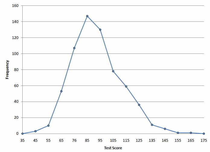
Figure 1. Frequency polygon for the psychology
test scores.
A cumulative
frequency polygon for the same test scores is shown in Figure
2. The graph is the same as before except that the Y value for
each point is the number of students in the corresponding class
interval plus all numbers in lower
intervals. For example, there are no scores in the interval labeled
"35," three in the interval "45," and 10 in
the interval "55." Therefore, the Y value corresponding
to "55" is 13. Since 642 students took the test, the
cumulative frequency for the last interval is 642.
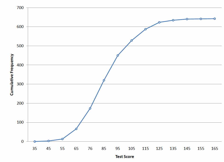
Figure 2. Cumulative frequency polygon
for the psychology test scores.
Frequency polygons are useful for comparing distributions.
This is achieved by overlaying the frequency polygons drawn for
different data sets. Figure 3 provides an example. The data come
from a task in which the goal is to move a computer mouse to a
target on the screen as fast as possible. On 20 of the trials,
the target was a small rectangle; on the other 20, the target
was a large rectangle. Time to reach the target was recorded on
each trial. The two distributions (one for each target) are plotted
together in Figure 3. The figure shows that, although there is
some overlap in times, it generally took longer to move the mouse
to the small target than to the large one.

Figure 3. Overlaid frequency polygons.
It is also possible to plot two cumulative frequency
distributions in the same graph. This is illustrated in Figure
4 using the same data from the mouse task. The difference in distributions
for the two targets is again evident.
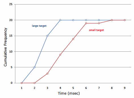
Figure 4. Overlaid cumulative frequency
polygons.

Comments
Post a Comment